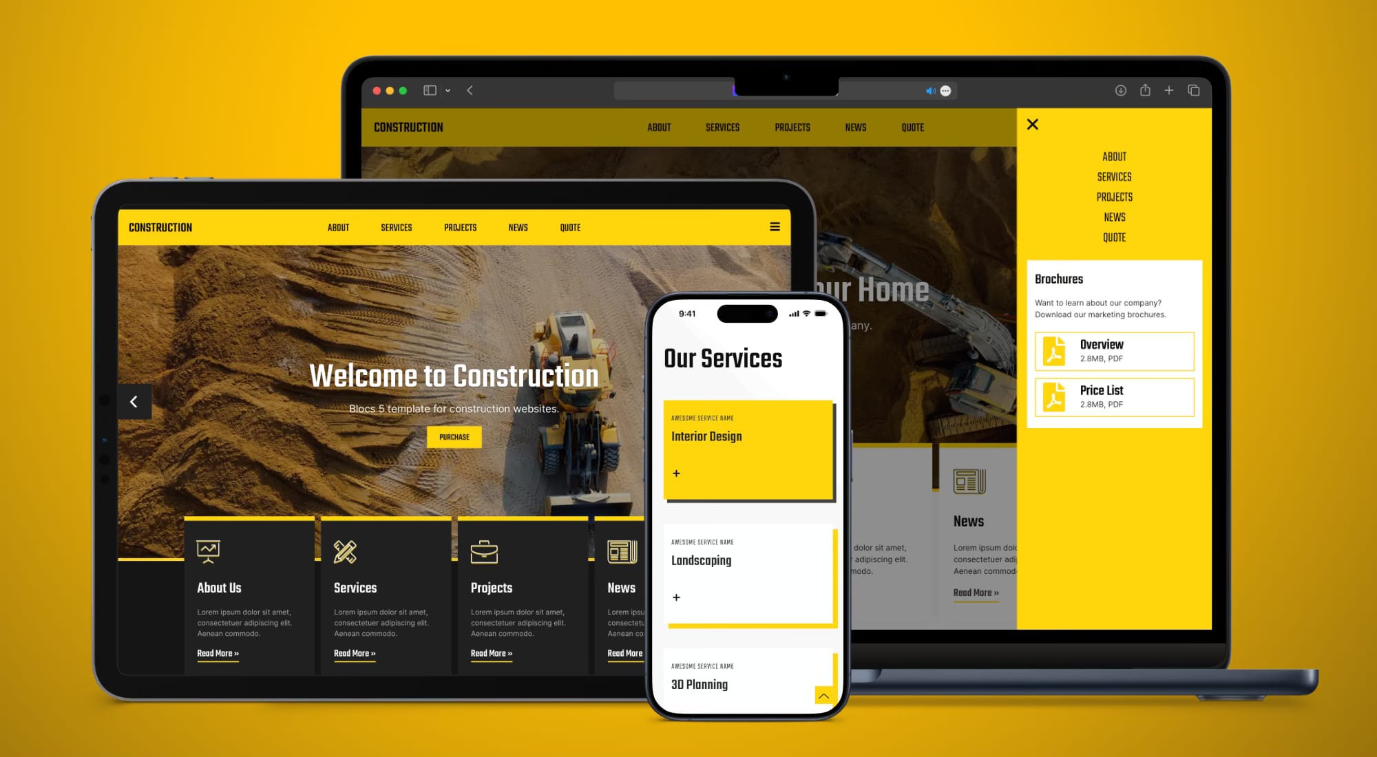
Construction Template Goes Dark
Introducing the brand-new version of one of the most popular templates we have ever created for Blocs: Construction 3.0.
Next week, I am finally releasing the completely new highest-quality template for Blocs with a unique sidebar design and a bunch of other cool features, based on the design of the EldarGezalov.com website. But, before that, I'm excited to announce the release of Construction Template Version 3.0!
This premium template for Blocs app now features dark and light versions, along with upgraded typography, enhanced mobile optimization, and more. Best of all, it's complimentary for existing customers and Blocs Master members.
What's New in Construction 3.0?
Enhanced Typography: Experience a refined and visually pleasing reading experience across all devices with our revamped typography setup.
Improved Mobile Optimization: Construction 3.0 offers enhanced mobile optimization, ensuring seamless browsing on smartphones and tablets.
Dark Themed Version: Choose between dark and light themes to align with your website's aesthetic preferences.
Typography Hierarchy and Styling: Elevate your website's design aesthetics with a new level of typography hierarchy and styling.
Improvements to Animations: Enjoy significantly improved animations and scroll animations across every single page.
New Inter Font: The template now utilizes Inter as the default font for paragraph text, with font files included in the package.


Available for FREE
The Construction 3.0 template is FREE for all existing customers who previously purchased it. Moreover, it's included at no additional cost for all Blocs Master members, ensuring access to the latest and greatest offerings for the Blocs app.


